Baja Beans

A rustic reset for a coffee brand.

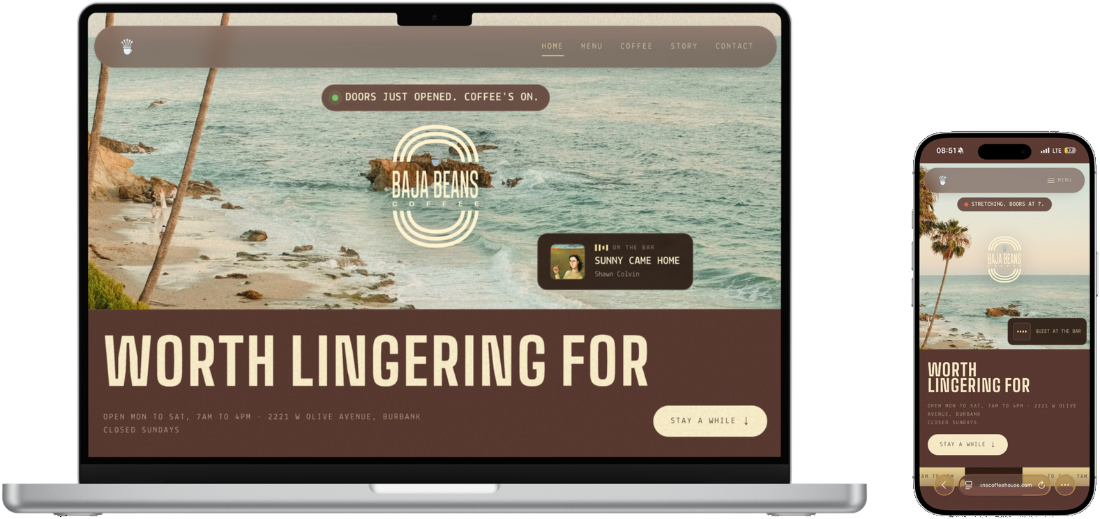
Baja Beans app
bajabeanscoffeehouse.com ↗Visit the live site
Client
Baja Beans
Year
2026
Involvement
Brand direction, site redesign

The problem

Baja Beans had a site that grew in every direction at once. No single voice, no single look, no single story.

What we did

The new direction grew out of the brand’s own 3D splash artwork — rustic, vintage, and warm. We rebuilt the site around it and rewrote every page fresh in that voice, keeping the facts and losing the clutter.

The result

A storefront that feels like the coffee: small-batch, sun-worn, and confident. Website usage time went up 260%, and customers began choosing their order on their phone before even walking in, speeding up store efficiency.

Website usage time up 260%.

Typography

Aa

Big Shoulders

Display

Tall condensed caps with market-poster energy.

Aa

Lekton

Body

A typewriter-flavored body that keeps the rustic tone.

Color

Espresso#2B1A12 · Ground
Cocoa#5B3A32 · Surfaces
Tan#D9C19E · Secondary
Cream#FFF3D0 · Ink on dark
Honey#FFE9A8 · Highlights
Terracotta#E76A56 · Accent
Leaf#7CC36B · Accent

Brand guidelines

  1. 01

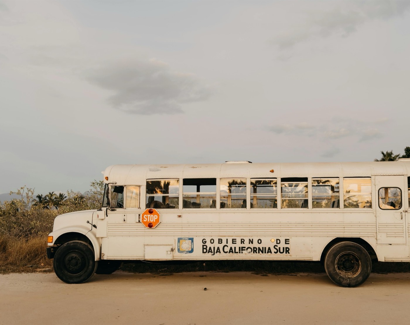
    Rustic and sun-worn, never polished flat — texture is part of the brand.

  2. 02

    Cream on espresso for signage; terracotta and leaf stay small, like fruit on the branch.

  3. 03

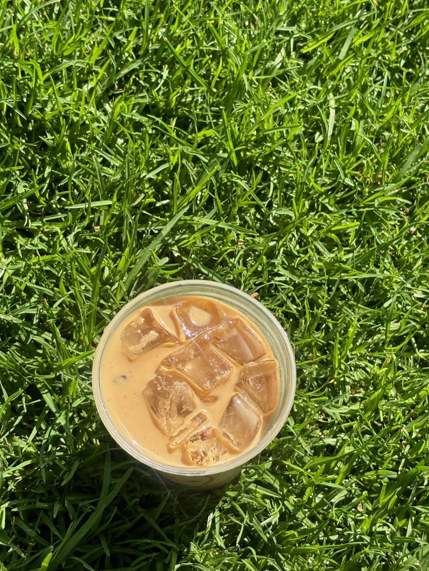
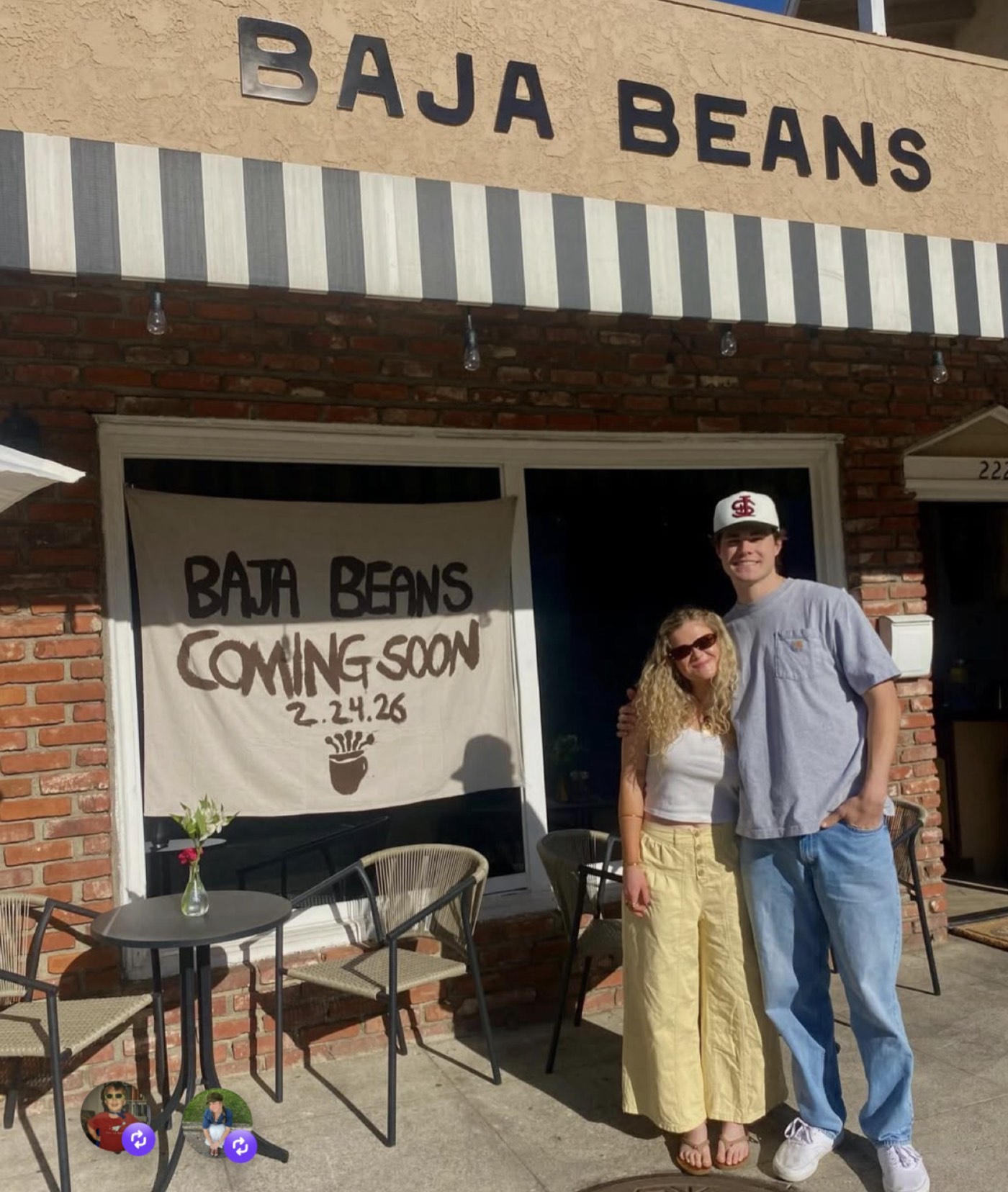
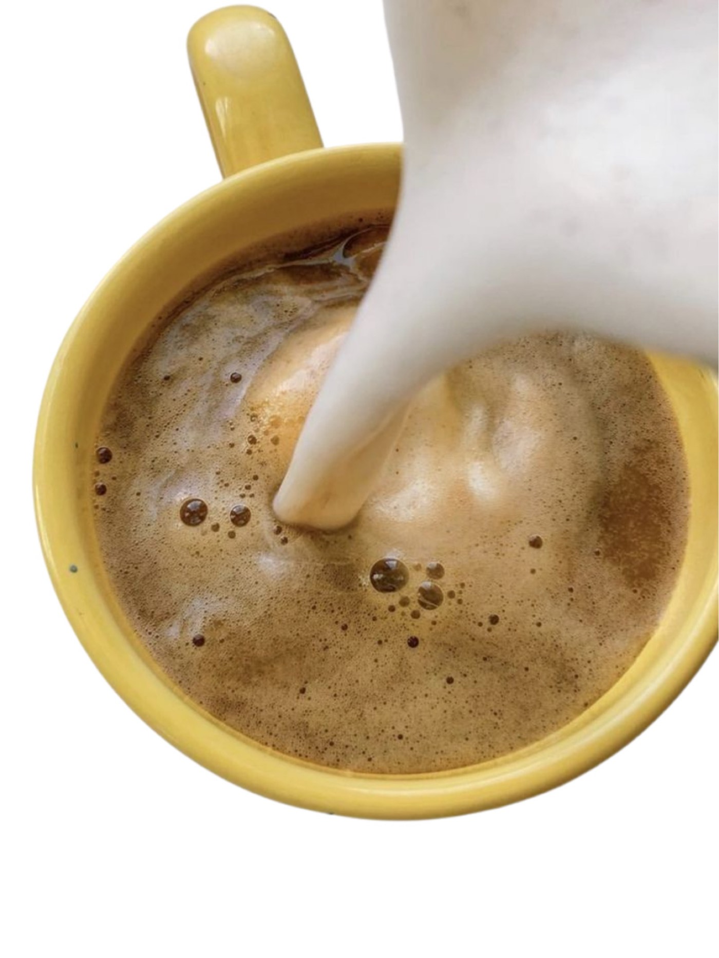
    Photography leads: beans, hands, and the Burbank shop — warm, close, and real.

  4. 04

    The bean mark can stamp, badge, and repeat; the wordmark always stays upright.

Brand pack

Big Shoulders · Lekton

Logo suite, bean stamps, palette, type pair, and signage rules.

The thinking

Every build here starts with research. Read the note behind this one.

Read the research ↗

Want results like this?