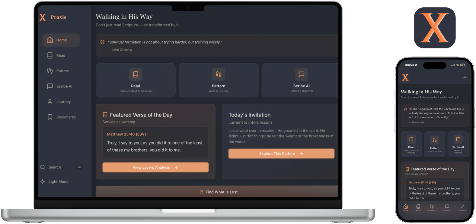
Praxis

A Bible app built for formation, not just reading.

Praxis app
praxisbible.com ↗Visit the live site
Client
Praxis
Year
2026
Involvement
Product design, app build

The problem

Most Scripture apps help you read. Praxis is built on a different conviction: Scripture is meant to form you, not just inform you.

What we did

We designed and built the full experience — deep-context reading across translations, a Pattern practice for walking out what you read, Scribe AI for reflection, and a Journey that tracks the walk — in a warm, quiet interface that stays out of the way.

The result

A native iOS app built for the App Store, designed for formation instead of streaks. Since launch, the userbase has skyrocketed 250x.

Userbase up 250x.

Typography

Aa

Merriweather

Scripture

A reading serif built for long passages on screens.

Aa

System sans

Interface

Quiet UI type that never competes with the text.

Color

Night#24282F · Dark ground
Parchment#F5F4ED · Light ground
Warm White#FAF6F1 · Cards
Ember#E85D1A · Action
Glow#FF7B3D · Highlights

Brand guidelines

  1. 01

    Scripture is the interface — everything else steps back.

  2. 02

    Ember marks action and insight, and it is used sparingly.

  3. 03

    Dark mode is night reading, designed first — not a theme afterthought.

  4. 04

    The chi mark carries the icon; type stays reverent and plain.

Brand pack

Merriweather · System sans

App icon, chi mark, day and night reading themes, and type scale.

The thinking

Every build here starts with research. Read the note behind this one.

Read the research ↗

Want results like this?