Walter

Travel booking that feels like one motion.

Walter app
scoutie.vercel.app ↗Visit the live site
Client
Walter, Inc.
Year
2026
Involvement
Product design, web app, mobile app

The problem

Finding and booking a stay means twenty tabs, three planning apps, and a spreadsheet. Walter is built on one idea: it should feel like one motion.

What we did

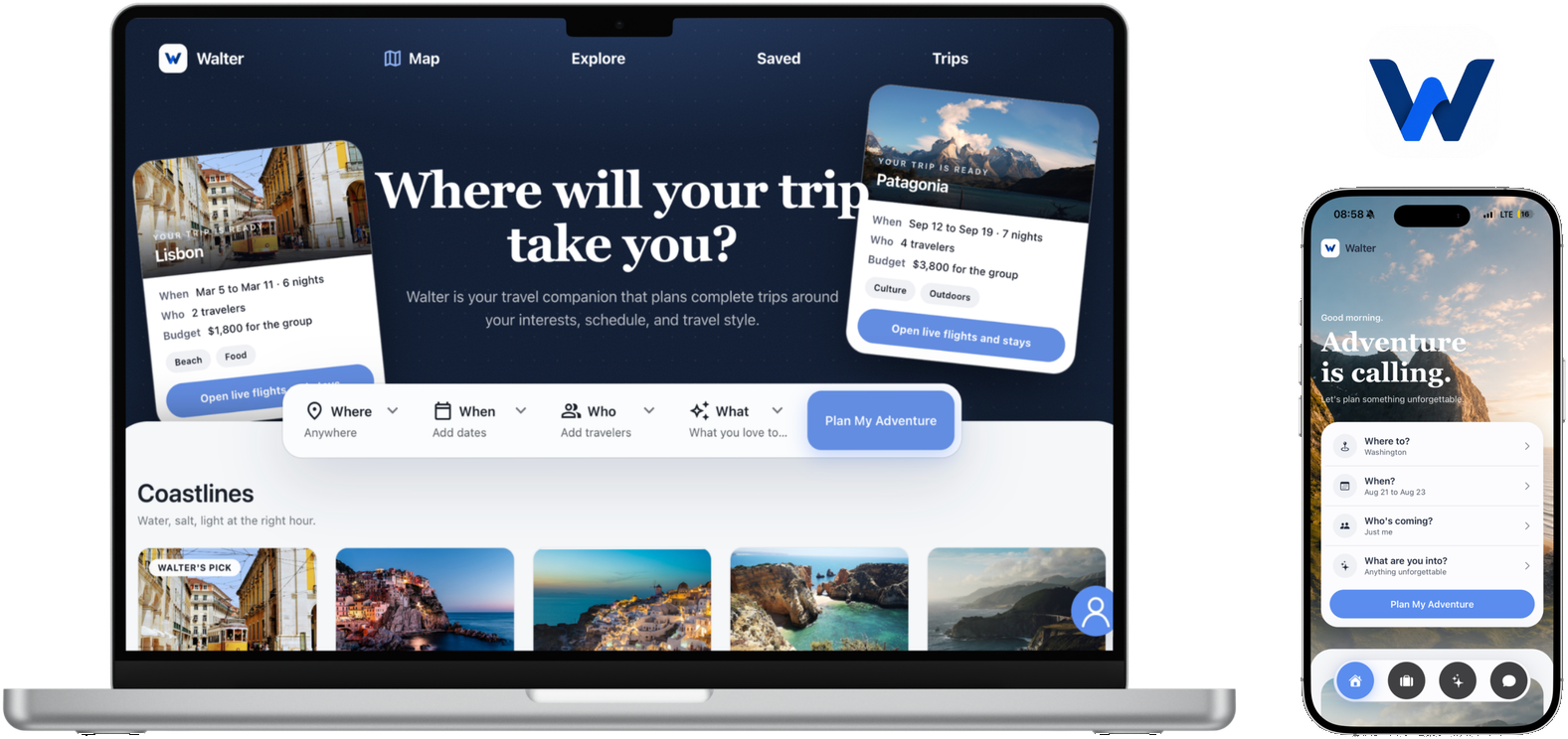
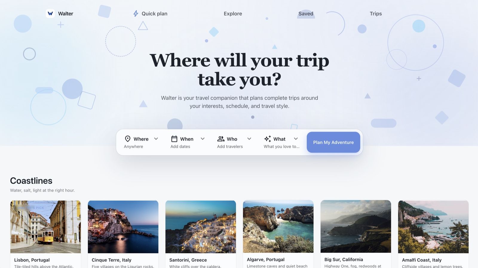
We designed and built the journey twice — a bright web experience with a full search-to-checkout flow, and a native mobile app in the Airbnb register with Walter’s own blue.

The result

Walter is still in development. The booking journey is built on web and mobile, and the ambitious part is underway: agentic purchasing, where Walter completes the booking for you.

Typography

Aa

Inter

Everything

The workhorse grotesque for a booking product — neutral, legible, invisible.

Aa

Material Symbols

Icons

One icon voice shared across web and mobile.

Color

Paper#FFFFFF · Ground
Walter Blue#5B8DEF · Action
Sky#7BA3F4 · Accent light

Brand guidelines

  1. 01

    White surfaces, one blue, and photography does the selling.

  2. 02

    Blue means action — buttons and links only, never decoration.

  3. 03

    Neutrals stay system grays so nothing competes with listing photos.

  4. 04

    The W badge carries the app icon; the wordmark runs the web.

Brand pack

Inter · Material Symbols

App icon, wordmark, blue action system, and booking UI patterns.

The thinking

Every build here starts with research. Read the note behind this one.

Read the research ↗

Want results like this?